27 Sep Pushing Pixels: A Fresh Approach to Incorporating Photoshop into Web Design
In the past couple years, since web developer Ethan Marcotte’s call for responsive web design, web design has seen significant changes. For designers coming from a traditional print background and accustomed to working within fixed dimensions, the developments in web design have posed a significant challenge to their traditional way of working. Web designer and educator Ian Yates addresses the limits of developing website layouts within Photoshop in his article, Photoshop’s Role in a Web Design Workflow.
In the early days of website development, Photoshop, with its robust tools for building layered graphics from scratch and its familiar interface, was the natural software choice for designers. With a limited choice of screen resolutions current, many designers worked assuming a fixed dimension based on the most common screen size. The workflow went from presentation of a static comp, rendered in Photoshop, incorporation of client feedback into the comp, and development of the website based on the final approved design. This workflow wasn’t perfect in that it ignored the inherent fluidity of websites and range of browser window sizes, but it functioned well enough.

With the advent of mobile devices, including smartphones and tablets, a workflow that begins with the dimensions of the website – what Yates termed “establish a fixed canvas and work inwards.” Responsive design requires “thinking from the content outwards, not the page boundaries inwards.” Additionally, working from a static Photoshop layout gives clients the expectation of pixel-perfect fidelity, and doesn’t take into account the flexibility of web typography and browser-rendered page elements.
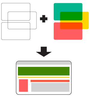
Instead, Yates proposes a fresh approach to web design which incorporates Photoshop, but isn’t reliant on it. In his workflow, the designer begins with a planning stage in which the relationships between content are sketched out and further developed in wireframes. Photoshop is utilized to develop the colors, textures, and visual elements of the website. The final step is to develop a working prototype of the website. Yates includes several links to resources for each step in this workflow process.
Yates’ article appears on the website, Tuts+, a hub of articles and tutorials on design and illustration, #D and animation, game design, development, audio and video production, and more. Tuts+ offers a wealth of resources for creatives at no cost – many of their articles and tutorials are openly accessible. More extensive tutorials are also available on Tuts+ Premium at a cost of $19 per month.
