25 Sep Road Trip! The Journey Behind the Cover Art for the Handbook’s 14th Edition
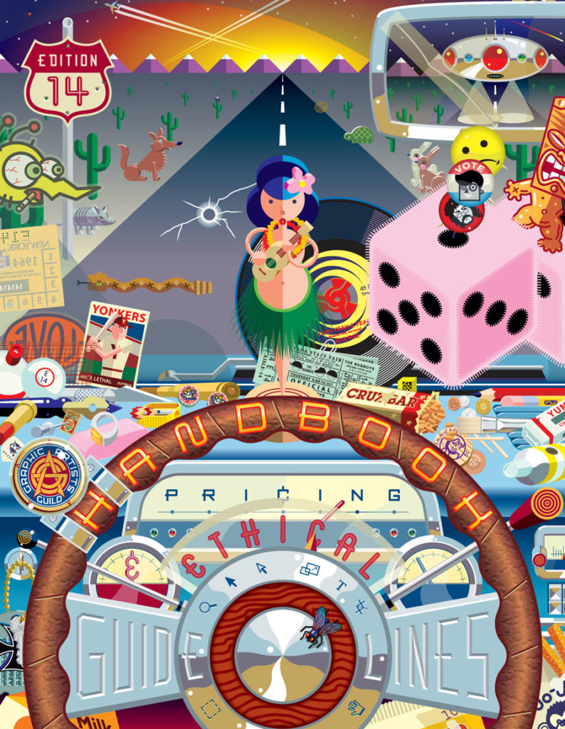
So what do Mr. Dill, a burnt draft card, a hula doll, and a wooden nickel have to do with pricing guidelines? These are some of the characters making an appearance in José Cruz’s cover art for the 14th edition of The Graphic Artists Guild Handbook: Pricing & Ethical Guidelines. Depicting the view from the driver’s seat on a long road journey, his illustration is an exhuberant, I-Spy mélange of detail. Look closely; the cover tells a tale.
Cruz had long been familiar with the Guild’s Handbook, having used it when he started his freelance design career in 1977. He was recommended by Michael Doret to create the latest cover art. (Doret is the husband of Laura Lynn Smith, the illustrator of the 13th edition, and is the designer of the Graphic Artists Guild’s logo.) Inspired by two of Cruz’s published works – “Mars vs. Earth” (Workman Publishing), and the serial illustration, “13 Bullets for Sam Spade” — the Handbook’s art director, Sara Love, suggested a roadtrip as a concept for the cover art. The concept is apropos for the Handbook, implying that the book functions as a road map for planning a successful creative career.
The resulting artwork tells the story of a long, adventurous cross country road trip. Clues to the identity of the driver (Joseph Cross, Cruz’s alter ego), time period, and location stud the illustration. A partially burnt draft card, with a registration date of 1964, places him squarely in the 1960s. The arrow-straight highway, with mountains looming in the distance and coyotes lurking at the side of the road, put the car in the southwest. A baseball card for a Yonkers player tells of the driver’s New York City origins, while the Bay State engraving on the car key, tickets from the Indiana State Fair, and trolley tokens from San Francisco hint at the driver’s circuitous route west. The journey is portrayed in the placement of the artwork, with the front cover depicting where the driver is going, and the back cover is the view through the side window, showing where he’s been. The glowing sky appearing over the horizon line hints at the unknown future.

Left: Right-click onto the cover image to pull up a large version. Left: An early sketch for the cover art. © Jose Cruz
The artwork also depicts the artist’s own creative journey. Homages to Cruz’s creative influences from his early career sprinkle the illustration. The fly perched on the steering wheel is a representation of an image by iconic album artist Charlie White III, one of Cruz’s first inspirations. A subtle reference to Milton Glaser, Seymour Chwast, and Pushpin Studios (hidden in a Gold Star trading stamp) acknowledges their support of at the start of his career. (Pushpin & Associates represented Cruz in the 1980s and Milton Glaser provided encouragement and exposure.) Even Cruz’s daughter Jo-X Rae and close friends, Daniel Pelavin and Michael Doret, make an appearance on the label of a 45 rpm record.
Cruz also skillfully places the Handbook and the Guild as central to the artist’s creative journey. The title of the book is framed in the steering wheel and dashboard, with the Guild logo functioning as a compass. (There’s also an homage to graphics software programs embedded in the steering wheel; familiar icons for pointers, cropping, and other tools appear to be engraved in the central column.) On the cover back, the description of the Handbook appears as the text on an actual roadmap.
The illustration is a showpiece for Cruz’s skill, and reflects his philosophy of “less is more and more is less, more or less.” His work ranges from the deceptively simple (such as his Simpletons), to the lushly complex. Working digitally permits him to construct layers of simple objects, creating complex, rich images. For the Handbook illustration, Jose researched source materials extensively, so that the details (such as “atomic” paddle ball souvenir) fit with the 1960s timeframe. The artwork also reflects Cruz’s artistic influences: the art deco styling of Joseph Binder and A.M. Cassandre, the geometric artwork of graphic designer George Hardie, the designs of the English artists Bush Hollyhead and Mick Haggerty, the lushness of Charlie White III’s illustration, and the beautiful typography of Michael Doret and Daniel Pelavin.
A nationally recognized illustrator with an impressive list of clients, Jose attributes his success to a lot of hard work – entering illustration annuals, and hauling his portfolio from meeting after meeting with art directors. He received his early art education at the Dallas Skyline High School from Bud “Norton” Hemedinger, a former NASA employee who taught commercial art, and from his TCU teachers graphic designer Margie Adkins, and illustrator Don Ivan Punchatz. Cruz’s first job was working for Punchatz at The Sketchpad Studio, a realistic fantasy-art shop. However, upon seeing the geometric artwork of George Hardie and Mick Haggerty, Cruz changed his style.
From that point, he began as a freelance illustrator, building in the 1980s and developing relationships with then prominent art directors such as Judy Garlan from The Atlantic, Fred Woodward from D Magazine and The Rolling Stone, Dan Lloyd Taylor from Money Magazine, Mitch Shostak at BusinessWeek, Milton Glaser, James Noel Smith from both the Dallas Morning News and the Times Herald, and Stan McCray from Houston City and Boston Magazine.
All images © Jose Cruz. www.x-factor-e.com/home.html